Mass Mobilization Protest Dashboard
Mass Mobilization Protest Dashboard
This project is an extension of a previous hackathon-style project that I created during my data science course. The objective of the course was to choose a dataset, formulate a research question, perform some exploratory data analysis, and fit and score at least one model, all within a six-hour time frame. I chose to work with Harvard’s Mass Mobilization Protest Data and the dataset and user’s manual can be found at the provided link.
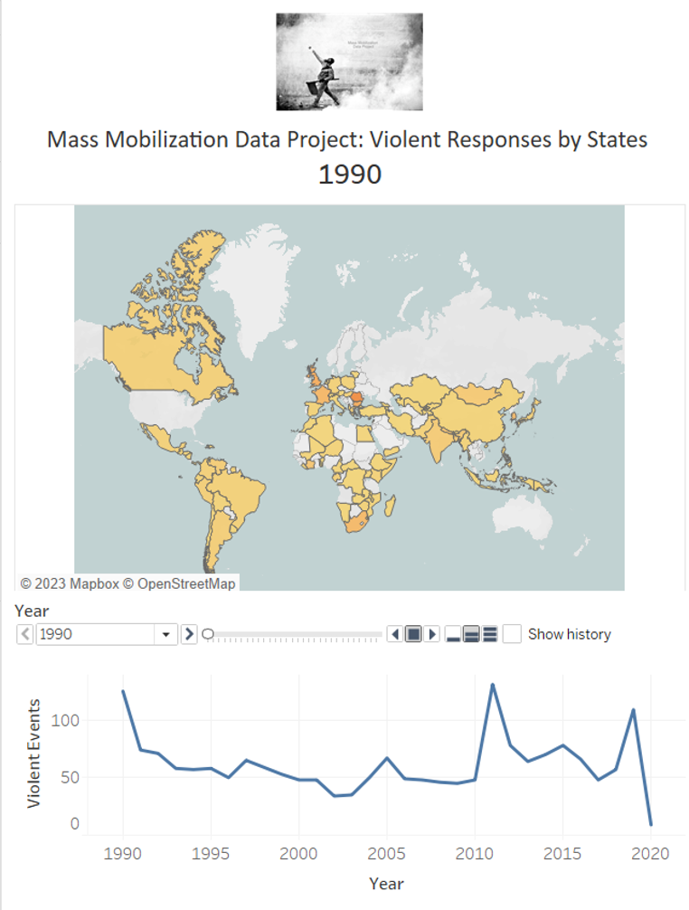
For this extension project, I decided to create an interactive map dashboard to visually demonstrate the use of state violence on protestors over the years. The original dataset included seven different types of responses by the states. I categorized the last three responses as violent and the rest as non-violent. I then used Tableau to create an animated dashboard that runs over the years and colors the states where there was the use of violence from the state’s side. The darker the color of the state, the more violent events occurred that year.
It’s important to note that this project is not meant to provide any political, cultural or social conclusions. Instead, it serves as an opportunity for me to explore my interests in data visualization and political sociology. Furthermore, it serves as a foundation for potential future projects that may delve deeper into the patterns of demonstrations in specific countries and time periods.
Click here to see the dashboard on Tableau Public.
Data were taken from Harvard’s Mass Mobilization Protest Data.
The github repo for this project is public [here].
![]()